Layouts
From brochures to magazine spreads or web applications, layouts should direct the eye, present the most important information in the most obvious way, and be invisible at the same time.
Bold images and white space help build a visual hierarchy. A layout shouldn’t scream everything at once. It should guide the viewers eyes and invite them into the story.
A layout fails if it isn’t functional. A good layout considers color, contrast, and readability, ensuring the “picture” you’ve brought to the page is accessible to everyone.
Lantern Magazine was a completely reimagined institutional publication. The previous magazine, Vantage, had changed very little in 40 years. In 2024-25, our Strategic Communications team compiled reader data and created a diverse team of voices representing the entire campus community to redetermine what the institutional publication should say, what it should look like, and how it would best represent an organization that had seen immense changes over the past decade.
You can see the complete publication here
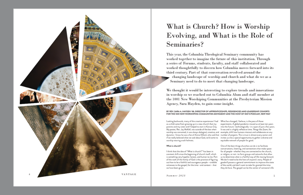
Creative uses of images can enhance or reinforce your words. This is also a great way to bring various ideas together in one layout.
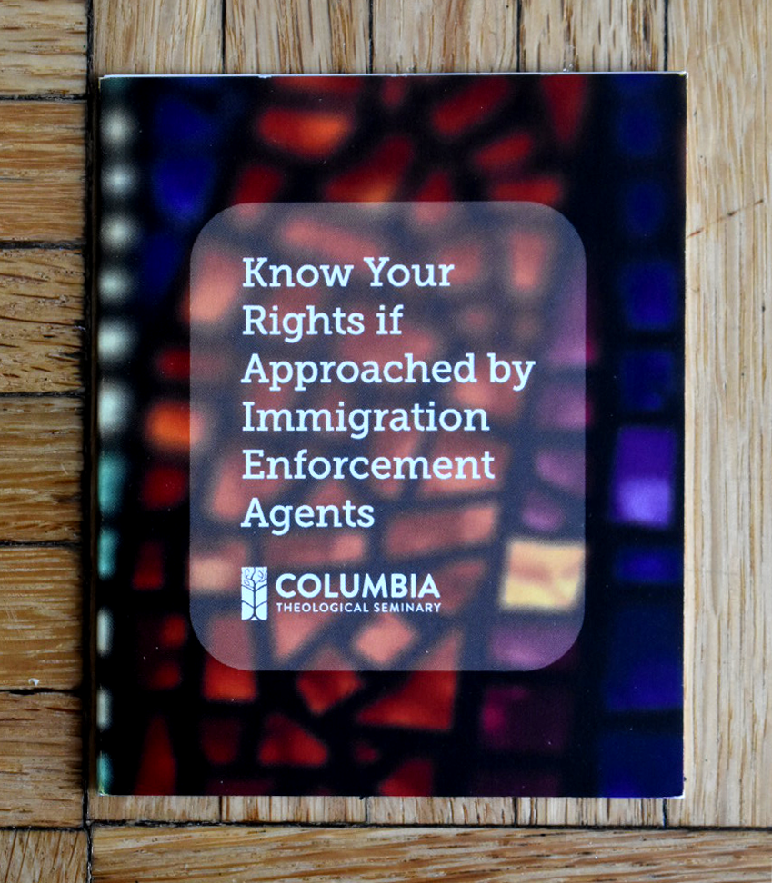
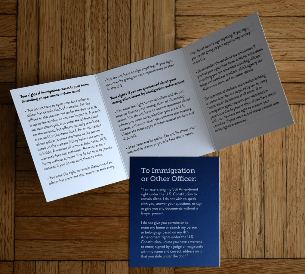
There’s more to layouts than filling (or not filling) space on a page. There is user experience in tangible objects as well as in web journeys. This brochure was created for a student population, largely international, to carry around as an immigration preparedness and response guide.
This brochure measures 3 1/2 by 4 1/4 inches folded. It’s small enough to fit in a pocket. Opened, it measures 3 1/2 by 14 inches and contains only the most vital information.
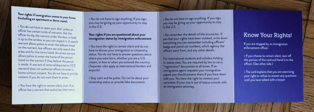
But, because human nature is entirely human, the piece was created with a perforated end panel with a script, vetted through legal, any student, especially non-native speakers, could easily tear off and hand to immigration officials.