
Layouts
From brochures to magazine spreads or web applications, layouts should direct the eye, present the most important information in the most obvious way, and be invisible.
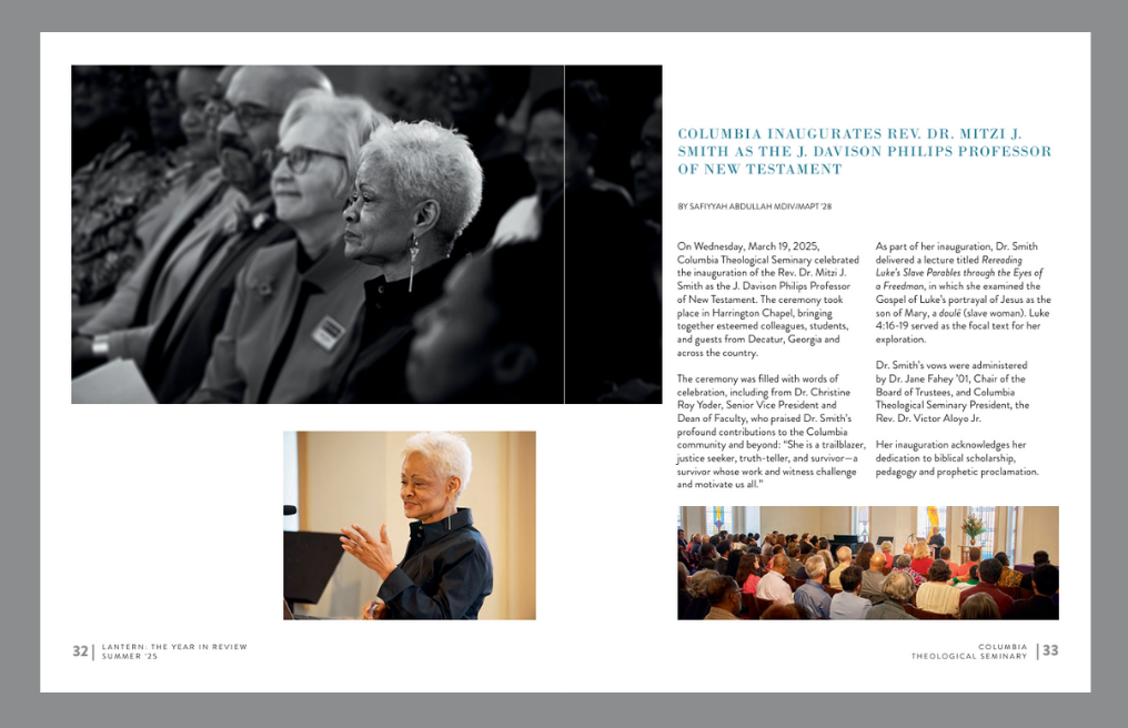
Bold images and white space help build a visual hierarchy. A layout shouldn’t scream everything at once. It should guide the viewers eyes and invite them in to the story.
A layout fails if it isn’t functional. A good layout considers Color Contrast and Readability, ensuring the “picture” you’ve brought to the page is accessible to everyone.
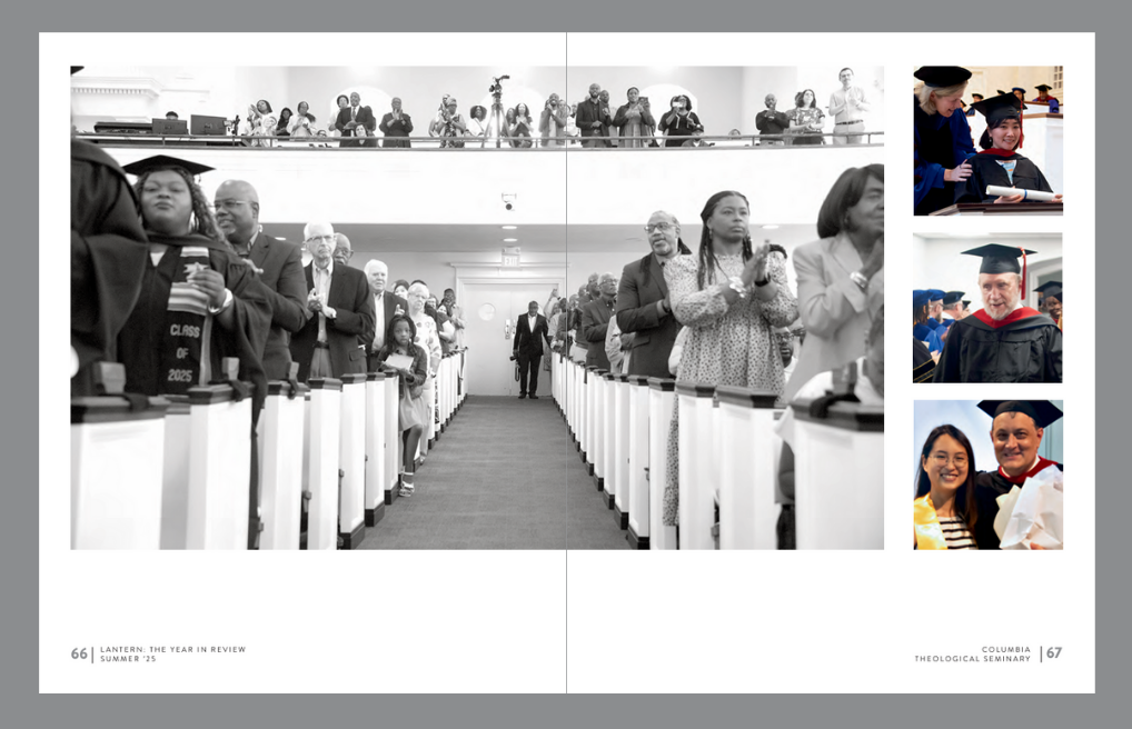
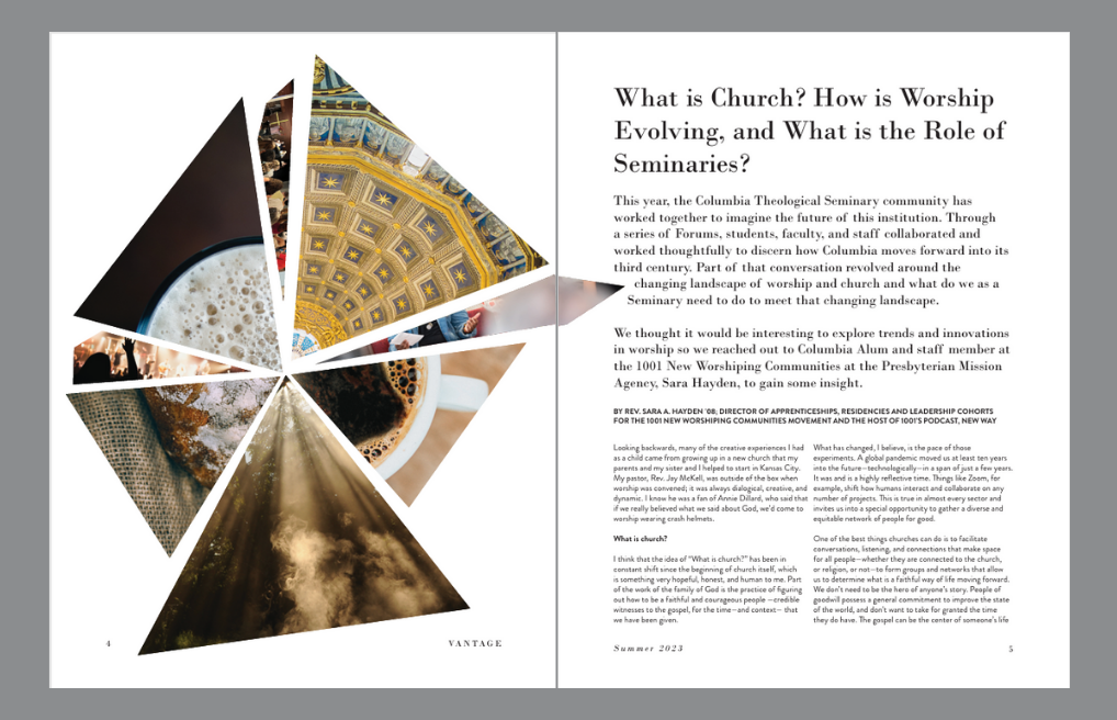
Creative uses of images can enhance or reinforce your words. This is also a great way to bring various ideas together in one layout.
